When I took Accounting 1, I dreamed ledgers. In those days most medium to small companies kept their books by hand and stored them in a fireproof safe. One of the requirements of the course was a complete set of books consisting of financial reports for a fiscal period. It was all done by hand on ledger paper. I did manage to do some of it at work, where I could use a claculator [sic].
The dreams helped internalize accounting, and to this day if I have a difficult accounting problem, I’ll start with ledger paper and lay out my solution. At some point I’ll see the solution and then complete my work in APL.
What this means is that I am not afraid of long columns of figures nor of large arrays. I can extract insights just by examining the reports and doing some simple arithmetic.
Most people need something more, and a well-designed graph is always helpful. Accordingly, this post describes how to produce a graph in GNU APL and how to dress it up for company.
Graphing is not part of the ISO standard, but many APL interpreters provide a graphing function. In GNU APL it is ⎕plot. The syntax is attributes ⎕plot data. The handle return by ⎕plot is an integer that identifies the graph. Close the window with ⎕plot handle.
The data is what will be plotted. For a vector of real numbers, the data point will be positioned along the Y axis, and its position along the X axis by its position in the vector. Plotting according to pairs of data is done using complex numbers, which are the sum of a real number and an imaginary number. Thus, for a two-column array we could produce a graph by converting each row to a complex number:
⎕plot a_b[;1] + 0j1 × a_b[;2]
Dressing graphs up for company requires setting attributes. ⎕plot ” will give you a list of attributes.
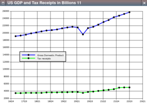
I got into a heated discussion recently about U.S. tax policy, which led to the graph we’re about to construct.
I downloaded my data from BEA.gov and imported it into APL:
      income_expense_raw←import∆file '/home/dalyw/AverageCrap/Research/Federal_I_E.csv'
      gdp_raw←import∆file '/home/dalyw/AverageCrap/Research/GDP_2017Q1_2022Q4.csv'
For our purposes all we want is gross domestic product, line 6 in gdp_raw, and federal receipts, line 6 in income_expense_raw.
      gdp←gdp_raw[6;2↓⍳25]
      fed_receipts←income_expense_raw[6;2↓⍳25]
We want to plot both statistics against an actual timeline so that the X axis labels show quarterly increments.
      SPQ←×/91 24 60 60		⍝ Seconds in one quarter
      q1←⎕fio.secs_epoch 2017 2 15
      time←q1 + SPQ × ¯1 + ⍳23
We build the attribute array:
      ⍝ Set the GDP line color to blue
      att_gdp_tax.line_color_1←'#0000FF'
      ⍝ Set the tax line to green
      att_gdp_tax.line_color_2←'#00FF00'
      ⍝ Set the legend to identify both lines
      att_gdp_tax.legend_name_1←'Gross Domestic Product'
      att_gdp_tax.legend_name_2←'Tax receipts'
      ⍝ Position the legend away from the two lines
      att_gdp_tax.legend_X←50
      att_gdp_tax.legend_Y←200
      ⍝ Set the caption to identify the graph
      att_gdp_tax.caption←'US GDP and Tax Receipts in Billions'
      ⍝ Set the format of the X-axis labels to show year and quarter
      att_gdp_tax.format_X←'%yQ%Q'
Now we can call ⎕plot:
att_gdp_tax ⎕plot (time + 0j1 × gdp),[0.1] time + 0j1 × fed_receipts
Quod erat demonstrandum.