Well, it’s done. That is, I’ve published the book I’ve been working on for the past three years. I never thought it would take three years.
You can buy it for your Kindle. Search for its title Crunching Numbers in APL.
Too much of this book is how to code APL and not enough of how to use APL. It is an unavoidable sojourn if you want to use APL to crunch numbers. So I’m going to write a series of posts on how to use APL.
We’ll start with inflation.
I suffer from my Wharton education, and one of the sources of that suffering is inflation. I attended Wharton during the seventies, when inflation got out of control. Wharton historically stresses monetary economic policies over Keynesian, and Milton Friedman was banging the drum for better control of the money supply. Washington has never really wanted to control the money supply, although during the eighties it had to.
I downloaded the Federal Reserve data on the money supply. (https://www.federalreserve.gov/releases/h6/current/default.htm) and created this graph:
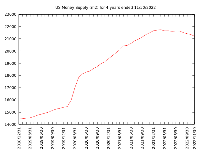
You’ll note the sharp increase in the money supply in January through June of 2020. This was the period when Congress enacted blowout bills that it believed would help people in economic distress because of the pandemic.
Money supply keeps growing to November of 2021, when the Federal Reserve executed policies to reduce the rate of inflation. It’s now February of 2023, and the rate of inflation has moderated but is still too high.
The curve shows a small decline as the Fed acted.
How did I construct this graph?
I downloaded the file from federalreserve.gov and imported it into APL. This gave me a table 774 lines by 30 columns. Line one was a description of each column. I picked column one, the year and month; column two, seasonally adjusted M1; and column three, seasonally adjusted M2. I now had a table 769 lines by 3 columns.
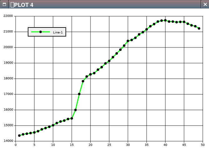
I made several graphs using ⎕plot. My first try was
I got:

I was alarmed. I had hoped I didn’t have to figure out the differences between M1 and M2, but when I graphed M2, I got what I expected:
I consulted the oracle internet. M1 is generally currency in circulation plus bank demand deposits (read checking accounts). M2 is M1 plus net time deposits (read savings accounts). I found that the Federal Reserve had changed the banking rules in April of 2020. Just showing the underlying data shows how banks responded:
      M1_M2[720+16 17 18;]
2020-03  4261.9 15988.6
2020-04  4779.8 17002.5
2020-05 16232.9 17835.2
I dressed the M2 graph up for company with gnuplot.